|
|
|
|
| ||||||||||||||||||||||||
|
|
Art tips and techniques, reviews and interviews from my studio. Archived here and at World Famous Comics. Comics 101 for 03/16/2006 Spike Vs. Dracula #1 Cover - Rough Sketch, Finished Pencil Art and Final Colors 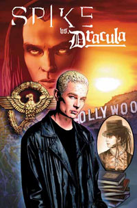 Here's a look at my process of creating the cover art for IDW Publishing's Spike Vs. Dracula #1 (written by Peter David) from my rough sketch and pencil art to final colors.
I went for the "movie poster" feel in my rough sketch for the first issue cover. I tried designing something that would hopefully encapsulate the entire series and give readers a taste of what's to come. I didn't realize it until the art was completed but the composition feels almost like an Indiana Jones poster, somewhat "romantic" in a way too. This only somewhat suits the ambiguosly complex, "modern" Spike character though he did start out as a poet before becoming a vampire after all. Hopefully, all of the fans will still really dig it. The objects I chose to include into the composition to represent the different eras of the overall story arc were inspired by Peter's script notes for the series. I'm thinking the map and Nazi emblem probably give it that Indy Jones, "adventure" feel. The series, as Peter has written it, is just as much horror as it is adventure, humor and romance. So it's epic in that sense and rings very true to the established Buffy and Angel mythos. So we've got our big bad Dracula looming over Spike in the upper right, that will blend in to a very vivid orange and yellow sunset over the Hollywood sign that we'll see in issue #2. To the left of Spike I have a Nazi eagle emblem that will be either made of gold or metal. I placed it behind his shoulder to partially hide it because censors will have a problem with the swastika. But, I wanted to include something to incorporate the Nazi plot point from issue #3. Underneath that I drew a street map of Rome, a location which will be featured in the fourth issue. I thought about making the map look tattered or burned on the edges when I got to the color stage, but I abandoned that approach since it was already subtle enough. To the right of Spike is a Victorian portrait of a young Drusilla in a riding hat. This will be painted in brown duo tones, like an old photograph from that era hence the addition of the frame. The old books are an accent element to balance out the composition and the imagery is actually meant to represent the first edition of Bram Stoker's novel, Dracula, which figures into the plot of the first issue. Have a look below. 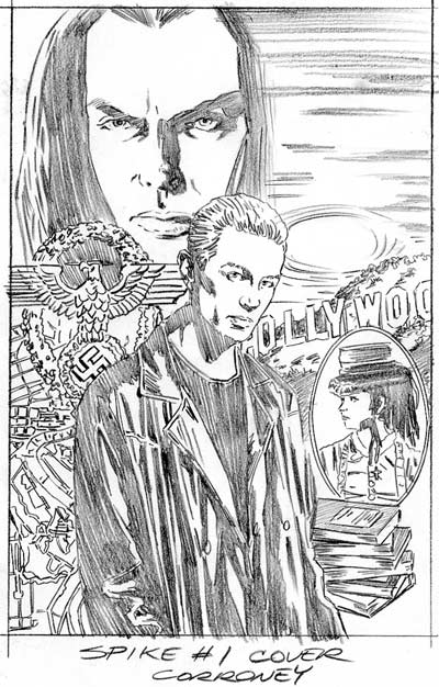 Final Pencils 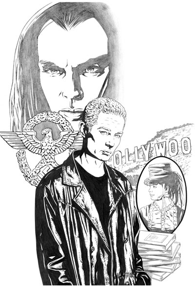 Final Cover 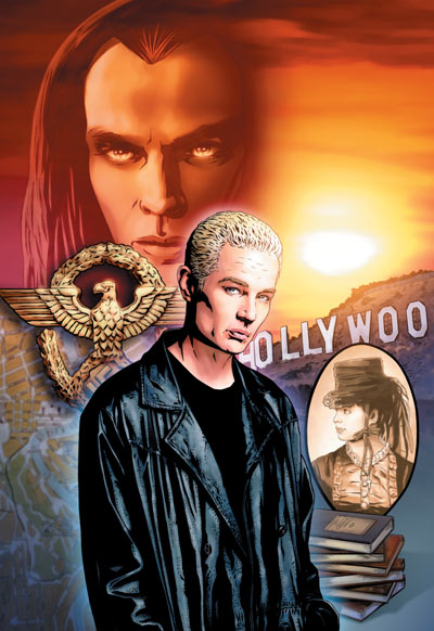 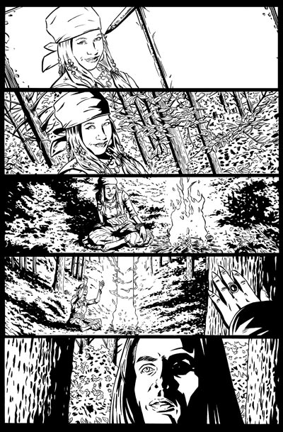 Spike Vs. Dracula #1 Page 2 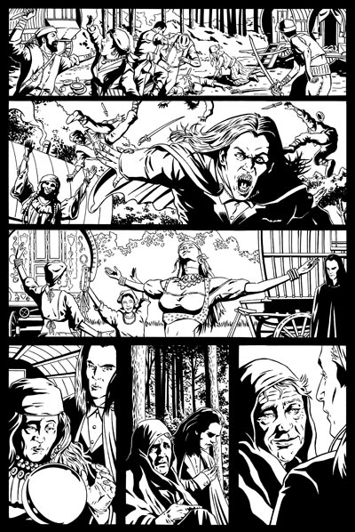 Spike Vs. Dracula #1 Page 12 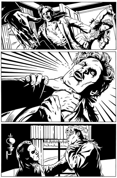 Spike Vs. Dracula #1 Page 15 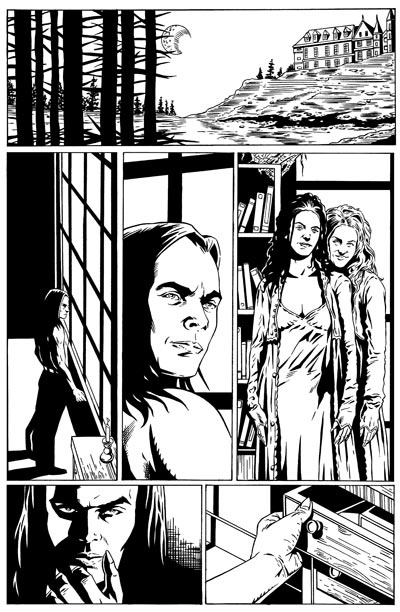 I'll be adding some more of the artwork from this issue to my website in the near future but in the meantime you can view more of my comic book art in my Comic Books gallery. I hope you enjoyed this look behind the scenes of creating art for this comic book and see you next week for another Comics 101 feature! -Joe Recent Columns:
© 2025 - , 224 Pinafore Dr., Norman, OK 73072 All other ® & © belong to their respective owners. | ||||||||||||||||||||||||