|
|
|
|
| ||||||||||||||||||||||||
|
Become a Patron! |
Art tips and techniques, reviews and interviews from my studio. Archived here and at World Famous Comics. Comics 101 for 09/14/2006 'Z' Formation In Page Design - Part 1 The use of 'Z' formation when designing a page implies that pencilers draw their images and construct their panels on the page in a sensible left to right, top to bottom format. The proper use of 'Z' formation should move the reader's eye from across the top left of the page eventually working to the bottom right. Creating a 'Z' pattern with action, perspective, compositional devices, and the shaping and sizing of panels themselves are the principles of this basic but important design process. Let's look at this example... 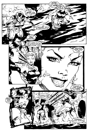 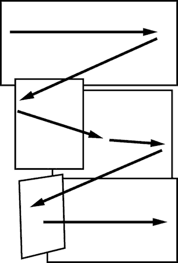 Example #1 from Blood and Roses 'Future Past Tense' #1 The penciler designed this particular page with a good sense of dramatic pacing. The use of close-ups, medium, and long shots are balanced nicely. In the first panel, a horizontal design is constructed as both main characters are placed towards either end of the panel. The graphic elements of the sewer water itself enhances the horizontal flow of the scene. It moves the eye from one character to the next across the panel. The second panel overlaps the first slightly, automatically pulling us back to the left side of the page. Within the second panel, the dominant, foreground character is looking towards the right side of the same panel at the secondary character. This smaller figure's arm is breaking the panel's border becoming a nice compositional device that points us in the proper direction of panel three. In panel three, the close-up shot of the female figure's head is slightly tilted down to the right, a subtle accent that �us pulls down towards the bottom of the page. The close-up shot in panel four overlaps heavily into the last panel, dramatically heightening the drama and speeding up the action. �In this last panel, we pull out for a longer shot of the main characters (again staged left to right �balancing out panel one) as they disappear running into the page, framed by the sewer pipes and directional lines from the interior walls. Notice the extra border framing in panel three that helps separate the action and linework from the surrounding panels and enhances the drama of the close-ups. Check back next week as we look at two more examples of using 'Z' formation. ********** The Art of Underworld and the Star Wars Road Trip Photo Contest Star Wars.com has updated their Hyperspace section with the online supplement for Star Wars Insider 89. This new update includes my article, "The Art of Underworld", presenting a behind the scenes look at my artwork for Insider 89's "Underworld: A Galaxy of Scum and Villainy" feature by Star Wars authors Ryan Kaufman and Abel Pe�a. You can read about my design process and inspiration and even have a look at some of my original photo reference, rough sketches and pencil art for these illustrations. You need to be a Hyperspace member to access this content. I hope everyone enjoys the feature! While you are visiting the official Star Wars website please check out this link and vote for photo #5 submitted by JLCLuna in Columbus. It would mean a lot to me if you did :) You'll need to be a registered user at Star Wars.com to vote but it only takes a minute to sign up and it's free. Thanks and I'll see you back here next week for another Comics 101 feature! -Joe Recent Columns:
© 2024 - , 153 Sheffield Way, Sandusky, OH 44870 All other ® & © belong to their respective owners. | ||||||||||||||||||||||||