|
|
|
|
| ||||||||||||||||||||||||
|
Become a Patron! |
Art tips and techniques, reviews and interviews from my studio. Archived here and at World Famous Comics. Comics 101 for 09/04/2003 THE IMPORTANT ELEMENTS OF STORYTELLING - Part 4 7) Textural Differences in Rendering Keep in mind that different objects require different approaches in rendering. For example, steel or chrome should be illustrated in a different technique than wood, fur, or clothing. Using different line weights and strokes of the pencil can help the reader visually identify and separate characters, materials, and objects in a scene. In this example, I use harder edged, pointy line work to resemble the outer edge of the wolf's fur and thinner but dense, curved line work to represent the inner folds of the fur. For the background desert texture, I use longer, smoother line work with some crosshatching to represent the sand. Of course, the small rocks and sparse blades of grass I rendered help to further lend authenticity to the background. Also, by using the heavier line work on the form of the wolf, and keeping the background line work thin and lighter adds weight and form to the animal and gives spacial depth and dimension to the illustration. It's these small details that helps break the wolf apart from the background image and give the separate forms their own look and feel. 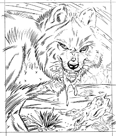
For this Star Wars themed illustration, I wanted each aspect of the forms to have it's own unique look, yet keep the illustration cohesive by arranging the elements in a dynamic montage. Using the decorative design elements of the type and the ornate, floral design are both simple but contrast each other nicely. The type has a geometric, mechanical, yet soft feel and the inorganic shaping of the flowers feel more angular and detailed. The rendering of the flowing line work in the handmaiden's robes contrast the stark, graphic silohuette of the young queen's portrait. I allow texture by using positive/negative rendering here as well, with the folds working into the negative space as lighter areas, along with the lighter areas of the feathers in contrast to the outer graphic edges. I use the x's here in these illustrations to indicate to the inker (in this case myself) where the flat blacks will be filled in with the india ink. This saves the penciler time and allows for a more graphic, efficient style. This comes in very handy especially when penciling a comic book page or illustration for approval under deadline. 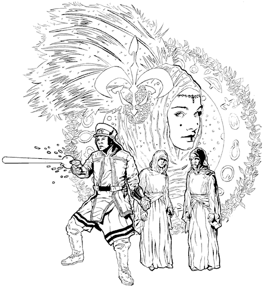
Though these are the rules I most often find helpful and applicable to comic book storytelling and art there are undoubtedly many more that could apply to the medium. Consider these elements as a starting point every time you begin a page but don't limit yourself to just what is written here. Comics are a medium where nothing is limited to the imagination and I highly recommend you check out Understanding Comics by Scott McCloud for an even more in-depth and philosophical approach to the medium and your work. Be sure to visit here next week for the next Comics 101 feature. -Joe Recent Columns:
© 2024 - , 153 Sheffield Way, Sandusky, OH 44870 All other ® & © belong to their respective owners. | ||||||||||||||||||||||||