|
|
|
|
| ||||||||||||||||||||||||
|
Become a Patron! |
Art tips and techniques, reviews and interviews from my studio. Archived here and at World Famous Comics. Comics 101 for 09/20/2001 Blood and Rose: Time Lords by Joe Corroney Week Three - The Roughs The following illustrations are examples of the full size page designs which I draw next by studying my smaller roughs. I draw these at full size on the actual Blue Line Pro Bristol board but am still keeping them rough as I try to tweak the designs of the illustrations in the panels by still focusing on the enitre page as a whole. I'm very concerned with the energy of these pages as I am slowly building from page 14 to the action of pages 15 and 16. I'm even penciling these three pages back and forth simultaneously as I try to keep this sequence consistent, in terms of the look and feel for the characters and environment. 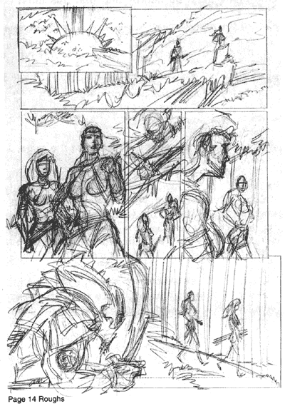 For Page 14, which establishes a new environment for the characters from previous script pages we haven't looked at yet, I decided on a small inset panel which stair-steps or overlaps into a widescreen shot of the cliff. The first panel is a flash of light in the middle of the jungle signaling the arrival of the main characters as they teleport into this new environment.
Panel two balances out the first panel as the main characters pose on the right side of the page. The cliff itself is almost designed as a compositional device to move the reader's eye across the panel. Panel three works well as a medium shot as it introduces us to the characters, giving us some nice detail and costume info, but still enough semblance of a background to keep the reader aware that these are the same figures as the silohuettes from panel two. Now that we established who these characters are, I decide to pull back out and up for panel four to show they are being watched in the trees above. I plan to use the silohuette technique a second time here as to not give too much away about this new character instantly. I will be blending him into the shading of the tree branches and leaves in the final pencil drawing step. Panel five balances the page nicely as it is a close-up shot of one of the characters, Blood, and a smaller medium shot of Rose, two sizes and angles we had yet to see on the page. Variety of shaping and figure sizes in the pacing of your panels is key to a well-balanced and designed page. You must take steps in order not to be too repetitious with similar angles, shapes, sizes, expressions, and poses or your page design will become flat and boring. In panel six, we begin to get a clearer picture of the character following Blood and Rose but by keeping his back to the viewer and his head or helmet still in silohuette with a technique called rim-lighting, we still keep him mysterious. Also, framing him on the left side of the page and allowing the reader to look over his right shoulder, we become involved with the character mentally as we perceive what he perceives, while he is stalking the main heroines. I also plan on designing the character with dramatic lighting along the right side of his form in the final pencil to move the reader's eyes down across the bottom of the panel and off the page. 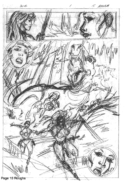 On Page 15, I designed the page as one large illustration from top to bottom. This is called a splash page as it looks more like a pin-up but serves the purpose of furthering the story, especially when displaying a key action scene at it's most dramatic. For this splash page, I illustrated smaller panels that exist inside the larger panel that are key reaction shots, heightening the drama.
I wanted panel one, the larger widescreen panel across the top of the page, to be deceiving somewhat. As from Rose's reaction, we assume she is surprised by the character stalking them from behind but it isn't until the large panel we see the new threat of a T-Rex emerging from the trees. �I positioned the reader's eye-level at the base of the page with Blood and Rose and played up the dramatic three-point perspective angle, making the T-Rex seem very large and even more dangerous with the girls seeming to run and jump right off the page. I like the design potential of circular panels but I only use them sparingly as it is often tricky to pull them off right on a page. Here, I thought they added a nice balance as I have the recurring theme of posing the girls side by side down this page. They also gave this page showcasing the dinosaur a kind of �pulp-Johnny Quest-adventure-comic' feel with the circular reaction shots. 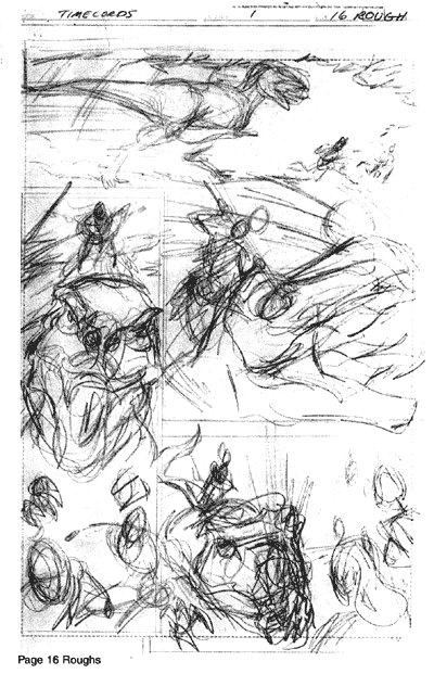 Finally, for page 16, I start off again with another wide angle shot to properly focus on the action of the T-Rex chasing the girls but being able to let the reader see all the characters interacting. I also wanted to display the sheer size, power, and speed of the dinosaur so that our main characters are only a few steps away from being chomped. It's very important in comics when showing action sequences to display the entire forms of the characters and not cropping even the slgihtest bits of anatomy off-panel. This allows for more excitement, energy and power for the characters and story. You'll notice I didn't crop the main characters in the large panel of page 15 as they are running and it is more eye-catching and powerful than if I were to crop them off at the ankles or sides perhaps.
Just as the girls are about to be pounced, another second new character jumps in from off-panel above in panel two. I plan on drawing this new character in a striking jumping pose without cropping any of her anatomy and adding action lines to heighten the speed of her movement and to blur her identity. Again, I'm going for a balanced page and variety of shaping and sizing for the dinosaur as I focus on it's face for a close-up. The long, narrow vertical panel enhances the paranoia of the scene for the main characters as we crop in on the dinsosaur tightly. This also plays up urgency of the shot even more-so as we feel trapped, confined and in danger just like the main characters. With the new character jumping in now to the left side of panel three, it helps move the action from left to right along with the angle of the T-Rex's face turning. I try going even larger with the dinosaur's face for this panel for variety and really close in on the action of it getting speared by the new character. For the last panel on this page, I have the dinosaur slumping to the ground, fatally wounded as the attacker stands victorious on it's head and using the silohuetting technique a final time for this sequence. Also, I have our main characters looking on from the right side of the page stunned by the bravery of their savior. Though, I am happy with my layout designs here, I end up adjusting the shots in panels two, three, and four as you will see in the final penciling process next week for a better and clearer design. -Joe Recent Columns:
© 2024 - , 153 Sheffield Way, Sandusky, OH 44870 All other ® & © belong to their respective owners. | ||||||||||||||||||||||||